
Images are the heaviest assets on most web pages. They account for roughly half of a typical page’s total weight — and on image-heavy sites like portfolios, eCommerce stores, and blogs, that number climbs even higher. A single unoptimized hero image can weigh more than the rest of the page combined.
This is exactly the problem BerqWP‘s Fluid Images was built to solve. It automatically delivers every image in the right format, at the right size, for the right device — without you touching a single line of code or configuring anything.
In this post, we’ll take a technical look at how Fluid Images works under the hood: the format detection cascade, container-aware resizing, retina support, and the CDN architecture that makes it all fast.
The Problem With Traditional Image Loading
WordPress handles images in a straightforward way: you upload an image, WordPress generates a few preset sizes (thumbnail, medium, large), and your theme picks one to display. The problem? That “large” image is the same 1920px file whether a visitor is on a 27-inch desktop monitor or a 375px-wide phone screen.
The browser dutifully downloads the full-size file and then scales it down to fit the container. On mobile, this means your visitor just downloaded 400KB of image data to display a 150KB-sized area. That’s wasted bandwidth, slower load times, and a worse experience — especially on mobile networks.
Retina displays add another layer of complexity. A MacBook Pro or modern smartphone needs a 2x resolution image to look sharp, but serving that 2x image to a standard display wastes even more bandwidth. Getting this right manually — with srcset, sizes attributes, and multiple image variants — is tedious, error-prone, and something most site owners never do.
The result: bloated page weight, slow Largest Contentful Paint (LCP), and poor Core Web Vitals scores. Google notices. Your visitors notice.
How Fluid Images Works
Fluid Images takes a fundamentally different approach. Instead of relying on WordPress’s preset image sizes, BerqWP analyzes each image’s actual container size on the page and generates optimized versions tailored to real-world screen dimensions.
Here’s the process:
1. Multi-version generation
For each image, BerqWP generates multiple optimized variants on its cloud servers (the Photon Engine) at widths like 200px, 400px, 600px, 800px, 1000px, 1200px, up to the original image width. Each variant is served from BerqWP’s image CDN at images.berqwp.com.
2. Lazy loading with SVG placeholders
In the initial HTML, the src is set to a lightweight base64-encoded SVG placeholder that matches the image’s exact dimensions. This reserves the correct space in the layout (preventing layout shift) while ensuring no real image data is downloaded until needed.
3. Smart srcset loading
The actual image URLs are stored in data-berqwp-srcset and data-berqwpsrc attributes. When the image enters the viewport, BerqWP’s JavaScript moves these into the real srcset and src attributes. The browser then picks the best variant based on the container size.Here’s a simplified version of what the output looks like:<img width="1374" height="864" src="data:image/svg+xml;base64,..." data-berqwpsrc="https://images.berqwp.com/?domain=example.com &w=300&mw=1920&q=90&url=https://example.com/.../photo.jpg" data-berqwp-srcset=" https://images.berqwp.com/?...&w=200&... 200w, https://images.berqwp.com/?...&w=400&... 400w, https://images.berqwp.com/?...&w=600&... 600w, https://images.berqwp.com/?...&w=800&... 800w, https://images.berqwp.com/?...&w=1000&... 1000w, https://images.berqwp.com/?...&w=1200&... 1200w, https://images.berqwp.com/?...&w=1374&... 1374w" sizes="auto, (max-width: 300px) 100vw, ..., 1374px" loading="lazy" /> Notice the URL structure: images.berqwp.com accepts the domain, requested width (w), max width (mw), quality (q), and the original image URL. The image CDN handles format negotiation server-side — it checks the browser’s Accept header and serves AVIF, WebP, or the original format automatically. No format is specified in the URL.
4. Responsive sizes attribute
The sizes attribute starts with auto (letting the browser match the container size), then includes media query breakpoints for common device widths (300px, 375px, 412px, 530px, etc.) all set to 100vw, with the original image width as the final fallback.
5. CDN edge serving
All generated variants are cached and served from BerqWP’s dedicated image CDN at images.berqwp.com, powered by 300+ global points of presence.
The lazy loading flow in action:
- Page loads → browser sees an SVG placeholder (a few bytes) → layout is stable, no image download yet
- User scrolls → image enters the viewport
- BerqWP’s JavaScript sets
srcfromdata-berqwpsrcandsrcsetfromdata-berqwp-srcset - Browser reads the
srcset, compares each variant against the container size, and downloads only the one it needs - Image CDN serves the optimal format (AVIF/WebP/original) based on browser support
The result: no wasted pixels, no wasted bandwidth, no wasted time. A 300px container on mobile gets a 300px image. A 1200px container on desktop gets a 1200px image. And every image is in the smallest format the browser supports.
All processing happens on BerqWP’s cloud infrastructure — your server does zero image work.
AVIF vs WebP vs Original: The Format Cascade
Image format matters as much as image dimensions. Modern formats like AVIF and WebP use significantly better compression algorithms than traditional JPEG and PNG, producing smaller files at the same visual quality.
Fluid Images now supports a three-tier format cascade:
AVIF — The Best Compression Available
AVIF (AV1 Image File Format) is the newest image format in mainstream browser support. Developed by the Alliance for Open Media, it uses the AV1 video codec’s compression technology for still images.
The numbers are impressive: AVIF files are typically 20% smaller than WebP and 50% smaller than JPEG at equivalent visual quality. For a photography-heavy page, this translates to massive bandwidth savings.
Browser support has matured significantly — Chrome 85+, Firefox 93+, Safari 16.4+, and Edge 85+ all support AVIF natively, covering the vast majority of web traffic today.
WebP — The Reliable Middle Ground
WebP has been the go-to modern image format for years. Developed by Google, it offers 25-35% smaller file sizes than JPEG with excellent visual quality. Browser support is near-universal at 95%+ globally, making it a rock-solid fallback when AVIF isn’t available.
Original Format — The Safety Net
For the small percentage of browsers that support neither AVIF nor WebP (primarily very old browser versions), BerqWP serves the original JPEG or PNG. No visitor ever sees a broken image.
How BerqWP Chooses the Format
When a visitor requests an image, BerqWP’s CDN checks the browser’s Accept header — a standard HTTP header that tells the server which image formats the browser understands.
- Browser supports AVIF → serve AVIF
- Browser supports WebP but not AVIF → serve WebP
- Browser supports neither → serve the original format
This detection happens at the CDN edge. There’s no JavaScript-based format sniffing, no extra round trips, and no delay. The first response the browser receives is already in the optimal format.
Importantly, BerqWP doesn’t change the image file extension — the optimized format (AVIF or WebP) is delivered using the Content-Type HTTP header. The URL stays the same regardless of which format is served, keeping things clean and ensuring seamless compatibility across all browsers and caching layers.
Real-World File Size Comparison
To put this in perspective, here’s what a typical image looks like across formats:
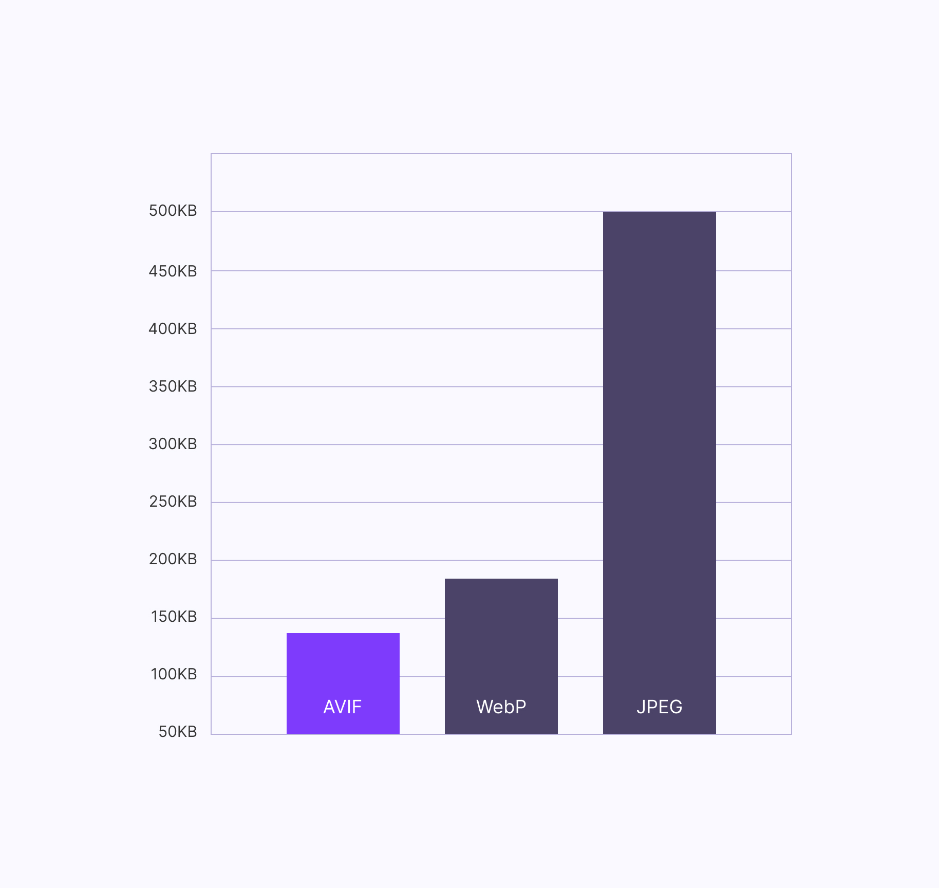
| Format | Typical File Size | Savings vs JPEG |
|---|---|---|
| JPEG (original) | 500 KB | — |
| WebP | ~175 KB | ~65% smaller |
| AVIF | ~140 KB | ~72% smaller |
Now multiply that across every image on the page. A blog post with 10 images could go from 5 MB of image data down to 1.4 MB with AVIF — a 72% reduction in image weight with zero quality loss.
CDN Delivery Architecture
Fluid Images are served from a dedicated image CDN at images.berqwp.com, separate from BerqWP’s static asset CDN (which handles CSS, JavaScript, and fonts at berqwp-cdn.sfo3.cdn.digitaloceanspaces.com).
This separation is deliberate. Image processing and delivery have different optimization requirements than static text files. By running image delivery on its own infrastructure, BerqWP can optimize caching policies, edge processing, and delivery specifically for image workloads.
Here’s how the delivery flow works:
- First request — A visitor requests a page. BerqWP’s optimized HTML references images from
images.berqwp.comwith the appropriate size and format parameters. - Edge cache check — The CDN edge node (one of 300+ Cloudflare-powered points of presence worldwide) checks if it already has this specific image variant cached.
- Cache hit — If cached, the image is served instantly from the nearest edge node. No origin server involvement. This is the common path after the first visitor.
- Cache miss — If it’s the first request for this variant, the image is generated by BerqWP’s cloud, cached at the edge, and served. All subsequent requests for the same variant are served from cache.
The result: after the first visitor triggers generation, every subsequent visitor worldwide gets the image delivered from the nearest edge node — typically in single-digit milliseconds.
Impact on Core Web Vitals
Fluid Images directly improves all three Core Web Vitals metrics:
LCP (Largest Contentful Paint)
The largest visible element on most pages is an image — a hero banner, a product photo, a featured image. LCP measures how long it takes for that element to render. Smaller, properly-sized images load faster, and BerqWP takes it a step further by automatically preloading the LCP image, so the browser starts downloading it before it even parses the rest of the page.
CLS (Cumulative Layout Shift)
Layout shift happens when images load without defined dimensions, causing the page to “jump” as images pop in. BerqWP automatically adds width and height attributes to all images, reserving the correct space in the layout before the image loads. No jumps, no shifts.
INP (Interaction to Next Paint)
A lighter page means less work for the browser’s main thread. When total page weight drops by 50-70% on the image side, the browser has more resources available to respond to user interactions quickly — clicks, taps, scrolls all feel snappier.
The Cumulative Effect
A typical page with 15-20 images can see a 30-50% reduction in total page weight from Fluid Images alone. Combined with BerqWP’s CSS optimization, JavaScript optimization, and critical CSS generation, the overall impact on PageSpeed scores is substantial.
How to Enable Fluid Images
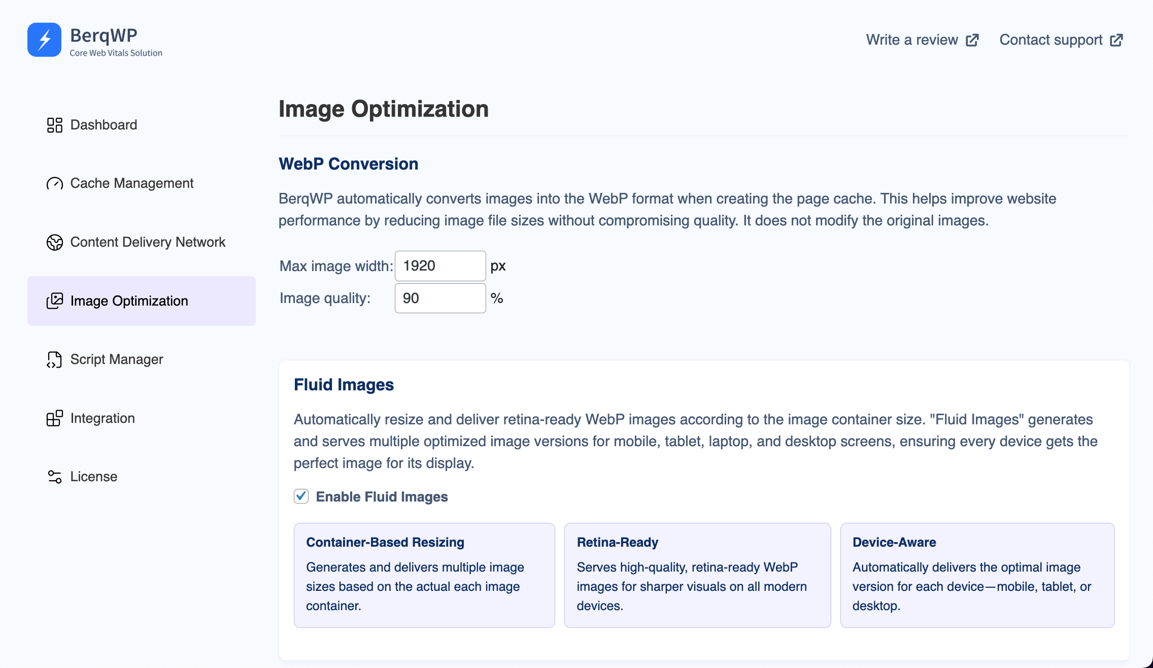
Fluid Images is enabled by default when you install BerqWP — no configuration needed. But here’s what to know about the settings:
- Fluid Images — Found in BerqWP > Image Optimization. Enabled by default. This is the main toggle.
- BerqWP CDN — Found in BerqWP > Content Delivery Network. Must be enabled (it is by default). Fluid Images relies on the CDN for delivery.
- Max Image Width — Controls the maximum width for generated images. Defaults to 1920px. Increase if your theme uses a wider layout.
- Image Quality — Controls compression quality. Defaults to 80%, which is a good balance between visual quality and file size. Increase for photography sites, decrease for further compression.
If you’ve just enabled Fluid Images or changed these settings, flush your cache from the WordPress admin bar (BerqWP > Flush Cache) to rebuild all pages with the new image optimizations.
A note on compatibility: BerqWP is fully compatible with image CDN plugins like imgix, Cloudinary, and BunnyCDN. If your images are already being delivered from an external image CDN, BerqWP will detect this and skip its own conversion — no conflicts, no double-processing. Your original images are never modified.
The Bottom Line
Image optimization is one of those problems that sounds simple but gets complex fast — multiple formats, multiple screen sizes, retina displays, responsive containers, CDN delivery, browser compatibility. Doing it right manually means managing dozens of image variants per image, configuring srcset and sizes attributes, setting up format negotiation, and maintaining a CDN.
Fluid Images handles all of this automatically. Every image on your site is analyzed, resized to match its container, converted to the best format the visitor’s browser supports, and served from the nearest edge node — all without you changing a single setting.
The result: dramatically smaller page weight, faster load times, better Core Web Vitals scores, and happier visitors. That’s what automatic image optimization should look like.
